Have an account?

Tuesday, November 23, 2010

Go Try It On, Online

One of a few sites I have recently stumbled upon that has peaked my interest and curiosity is gotryiton.com. This site doesn't really fit into any of the categories of websites listed in our chapters, but I guess essentially it is just a "fun website" since it is not actually selling anything and just provides an interactive/fun experience for users.

Gotryiton.com’s concept is simple and defined in their tagline, Get an Opinion | Give an Opinion. The website offers two different experiences: you either act as a “Reviewer” and use the site to help others out with their look or you post your own photos of yourself (with the option to blur out your face) to get opinions from others about your possible outfit options, if you should buy the red shirt or the white shirt, if you should wear heels or flats on a date etc. 


The ridiculously simple and creative way this site addresses a need that the public has faced for a long time (and put it online) impressed me. You can literally be in the changing room at the mall, wondering if you should buy that fabulous (or so you think?) outfit you have on, but your friends bailed on you for the shopping trip and now WHO will tell you what they think? Well you take out your smart phone, snap a pic in the mirror, post it to gotryiton.com (or use your trusty gotryiton app if you have it) and all you have to do is wait a few minutes before at least a couple people will instantly give you feedback. Problem solved! You now have those much needed opinions and won’t walk out of the store regretting not buying that outfit, or WORSE, looking like a drag queen in a clown suit in your new outfit because no one helped you out with their thoughts!  


I like it because:
  • It’s so simple and easy to use and offers a service that has been much needed for years
  • It’s instant feedback
  • You are able to both GET an opinion and GIVE an opinion as well
  • It’s actually a useful and functional website that can be used in your daily life (e.g. what should I wear to go out tonight? Is this appropriate to wear to work? Should I buy the dress or the skirt? Does my hair look better blonde or brown?)
  • Open and honest environment where no feelings can be hurt face to face because you are an anonymous part of the online community
  • Beautifully designed and visually capitivating
  • Fun to use and even just to explore
  • Don’t need to be a “member” of the Go Try It On community to be able to give an opinion

      There isn’t much I would change to be honest! The website itself is laid out in a functional, fun and easy-to use format with convenient and accessible buttons and links, and not too many things that overwhelm. One small hiccup I think could be fixed would be that they need a little bit more of an explanation on the homepage as to the entire purpose of the site. The founder uses a lot of emotion and personality in some of her statements on other pages, but they are missing that fun conversational homepage blurb that properly explains the website. The only other thing I would change regarding the site and service in general, would be that they should advertise more. I only stumbled upon it through a co-worker’s suggestion otherwise I probably wouldn’t have heard of it. They need to promote it more because I know for a fact many people would become users of this site if they were aware!


Wednesday, October 20, 2010

Time Warp

I think advertising is much more subtle these days; it’s amazing what advertising creeps into our daily life before we even realize it is actually advertising. In the 50’s and 60’s, it was quite clear-cut what was advertising and consumers, in most cases, were able to recognize and pick out advertisements without much effort. Advertising has spanned into all mediums, and is popping up in just about every place imaginable these days. For instance, product placement has become a commonality in just about every form of entertainment, and most consumers don’t realize the psychological effects of seeing certain brand names displayed in their favourite TV shows or movies. We don’t think about it when we go out and specifically seek out a designer jacket because we saw it in worn in a new movie, or when we go out and buy a certain beverage that we saw someone drinking in a TV show. I think the public has become much more desensitized to advertising messages because we are so inundated with them day in, day out.

Advertising, much like other industries, is not a static industry – it changes with the conditions around it. Society has morphed and changed from what it used to be, with new medical discoveries, rapidly changing technological advancements, new trends and the like. Advertising is an “adjustable” industry with it changing according to what is current and important in the marketplace. One fundamental change between current ads and fifty year old ads is the obvious adjustment to the discovery of the health effects of smoking. To us, it seems unimaginable that doctors used to endorse brands of cigarettes back in the 50’s and 60’s, when now we are exposed to advertising promoting the new “it” product on the market that can help you quit smoking. Quite a turnaround. 

1950's CAMEL Cigarettes Ad
Recent NicoDerm Patch Ad (Note the #1 Pharmacist Recommended Brand)

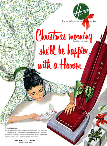
Another major difference that most people could probably come up with just off the top of their head is the common female stereotype displayed in many of the fifty-something year old ads. It’s amazing how far we females have come through the eyes of advertising. Women stayed at home, were expected to have dinner on the table when the man got home, raise the kids, clean the house – and all of these things were prominently represented in advertisements back then, such as this one:

Hoover 50's Ad 
Although we have come a long way, as females displayed in ads, since that time – somehow we can still be displayed as objects through use of sexism. We have gained a lot more respect and aren’t stereotyped as housewives who exist to serve their husbands, but sex sells and females are still “used” a lot in ads through sexual innuendos, etc. So we may have gained some headway, but these sexist ads with females being displayed as sexual objects still put us back a few steps. 
  
Clearly the advertising industry has come a long way in the past half-century. Yes, some stereotypes may still exist, but it is definitely fascinating to track the history and progression of advertising through the past five decades. It’s interesting to see how certain stereotypes have transformed into a whole set of new stereotypes, and how advertising has adjusted to the many technological advancements such as internet, mobile phones, etc. No matter what year it is, 1950 or 2050, I don’t think advertising is an industry that is going away anytime soon. What will never change is the need to reach the public with messages that we hope will ignite desires and needs people never knew they had.


MADMEL

Wednesday, September 22, 2010

Colour Me Sherwin


So this will be my very first official blog post! Without wasting everyone's time with a big introductory spiel I will dive right into the assignment at hand. Let your vision be wooed...


It didn't take much to jog my memory about this campaign from a few months ago. It is very rare, as I am sure everyone can relate, that we not only specifically remember a campaign from a while ago, but actually recall liking it and remembering the campaign with a certain fondness, even with (gasp!) a smile on our face.

First of all how can you ultimately not enjoy (even a little bit) a commercial that could have you seeing rainbows in your dreams for weeks? This Sherwin Williams campaign that launched back in June was unique, creative and - well - colourful (for lack of a better descriptive word) to the point of no return. You may be able to taste the rainbow with Skittles, but Sherwin Williams puts Skittles to shame with this campaign that proves seeing a vivid rainbow of colours practically jump out at you is just that much better than tasting it. The way Sherwin Williams goes even further is the simple fact that not only are their commercials visually captivating - but YES - these colours you are seeing - well you can have them in your very own home; you can see them everyday! 

I`ll be completely honest, before I saw this commercial I had only really known of the brand Sherwin-Williams because I used to drive by a Sherwin Williams paint store on my way to work. For me, there is no brand preference in my mind for paint stores, and I had no real perception or opinion on this Sherwin Williams paint store. So, at least in my case I think, their campaign did the job it was supposed to because I view Sherwin-Williams in a totally different light. I guess I hold a very positive attitude towards them now because I truly did marvel at their commercials and print ads in this campaign. Maybe it`s silly or maybe it`s just that easy with a campaign like this one.


I guess I have been going on and on all about this awesome campaign without even fully explaining said "awesomeness". Well since it's whole success really relies on the visual appeal, I will let the commercials and print ads do the talking first and foremost. The two commercials that ran are linked below, with the accompanying campaign print ads scattered throughout the post.


So after viewing the commercial, hopefully you might have had half of the eye-opening experience I had. Simply put, I actually truly enjoyed watching the commercial - and not just because of the "ohh-la-la" colour show. I thought it was truly unique, different, original and most of all, FUN. I guess I liked it even more knowing that a product/brand such as your regular paint store, that typically doesn't impress or excite the consumer, had such a fun and engaging commercial. Its simplicity and wonderfully artistic rendition of a world made out of paint chips really captured and represented a brand identity to make it stand out from the rest of your average paint stores. (I mean really - is there a large part of the population who so strongly feel preferential towards one specific paint store?) In general, I loved how something so ordinary was all of a sudden turned upside down and became a whole different world. I think it was a spectacular vision, and was played out magically. 


There were actually two firms that worked on this campaign. McKinney is the advertising agency that handled the campaign, while a design-driven creative firm was responsible for the actual artistic creations using real paint chips. McKinney is an innovative and well-respected advertising agency that was recently voted as one of the world's best ad agencies to work for according to Ad Age. They currently have clients such as Nike, Gold's Gym, Coldwell Banker and Travelocity. When addressing a possible question a potential client might wonder, "
Why McKinney?" their response on their website is, "We're here to create game-changing ideas that make extraordinary things happen." Buck, the artistic geniuses behind the actual masterpiece that is the paint-chip world, work with a wide range of clients in the advertising, broadcast, retail, film and entertainment industries. They use animation, visual effects and live action to create their client-focused creative work.

I found the campaign to be highly effective in its presentation. It truly expanded the normal horizon of creativity, and did it in a beautifully put-together, captivating and enticing way. It captured the essence of a surreal world and held your attention. The effectiveness, I believe, was obvious in the simple way in which paint chips were transformed into something real, almost touchable. The way these paint chips were artistically crafted to create an alternate universe that is entirely made out of them mirrored the way paint can transform your own universe in your home into an entirely different place; a different world. This campaign gave the brand, Sherwin Williams, a strong (and positive) brand personality that perhaps was not present before. I think they used the mediums of television and magazines to their advantage, and chose them wisely in order to reach their target market. It was effective because not only could its' artsy and colourful adaptation appeal to people of all ages, but the visual simplicity and uniqueness of it all could be appreciated by any one. The way Sherwin Williams put words into colour was effortless, and I really think they have now burned a vivid and bright image into the mind and memory of the consumer for a good long while.